Bwin
Prepaid Packaging Design Challenge
Bwin
Prepaid Packaging Design Challenge
Bwin
Prepaid Packaging Design Challenge


The Backdrop
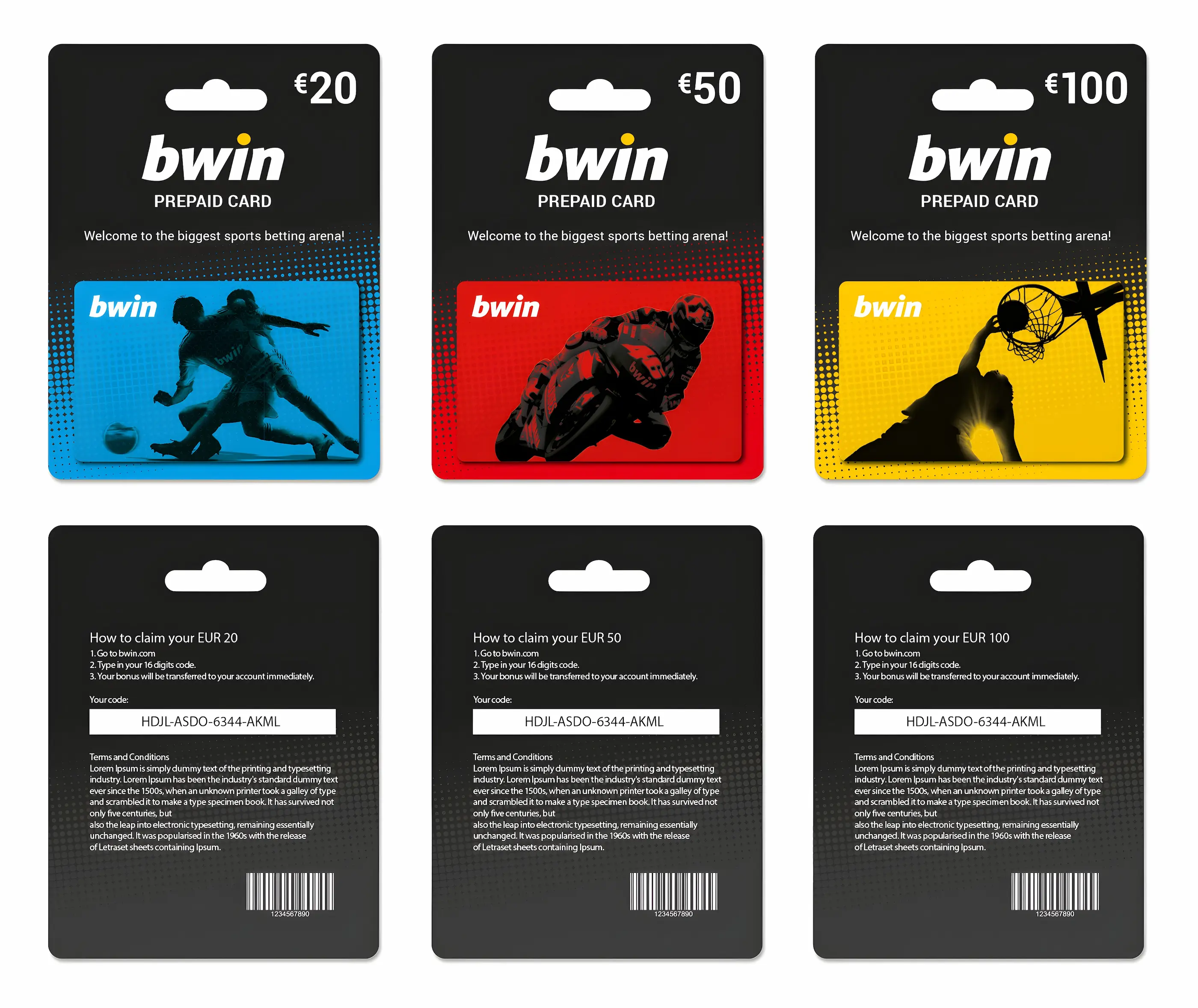
Bwin, a powerhouse in online gaming, decided to stir things up with a friendly design face-off. Known for their sports betting and poker platforms, they challenged designers from their London and Vienna offices to reimagine their prepaid cards. The challenge? These cards needed to stand out on retail shelves across Europe.
The Mission
As a competitor in this design showdown, my task was to create a prepaid card design that would turn heads and fly off shelves. The goal wasn't just to make something pretty – it had to embody Bwin's brand, connect with customers, and work seamlessly in hundreds of retail spots across the continent.
Making It Happen
The journey began with careful planning, starting from brainstorming ideas to bringing the winning concept to life. Key steps included researching consumer preferences, understanding Bwin's brand values, and considering the practical aspects of retail display. The process involved making improvements through iterative design, incorporating feedback, and paying close attention to detail, ultimately shaping the concept into a successful solution.

The Result
My design won the Bwin Prepaid Cards and Packaging Design competition. This victory wasn't just about making a pretty card – it was about creating a design that was eye-catching, aligned with the brand, and ready for retail across Europe. It proved I could deliver designs that not only look great but also achieve real-world results in a competitive market.
